
 Your entrance sign is your property's best form of advertising. Your entrance sign is your property's best form of advertising.
“You never get a second chance to make a good first impression.” – Abraham Lincoln
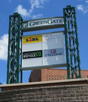
Okay, so maybe it wasn’t the nation’s 16th president who originally said that, but he certainly could have. It’s a famous quote, not attributable to any one individual, that applies to our personal lives, professional reputations, and for purposes of this blog, the entrance signs we build for our clients. No matter what type of property you manage – shopping center, hospital, office park, or mixed-use – the entrance sign is the first impression you will make to potential visitors. I’m often surprised by how property managers and owners treat these prominent landmarks as afterthoughts. The fact is that an entrance sign can be the one feature that draws people in – or drives them away. When visitors arrive, it is the entrance sign that tells them just what kind of place they’ve come to. Therefore, the big question you must ask when considering your entrance sign – whether it’s a pylon or monument – is, “What kind of first impression do I hope to make?” Here are four keys to putting your best foot forward. 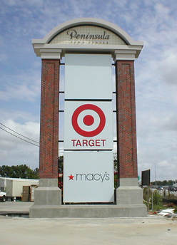 As cars zoom by this entrance pylon, drivers can still identify the primary tenants. As cars zoom by this entrance pylon, drivers can still identify the primary tenants.
Clarity is King
Entrance signs are meant to be read and provide basic information that visitors need. Therefore, make sure they are clear and designed to be quickly read. Letter sizes, fonts and colors, and the sign’s background colors should be selected first and foremost with an appreciation for the ability of the intended audience to effortlessly read what the sign says. Don’t sacrifice the usefulness of the sign for something clever and flashy. Clarity means limiting the number of elements in your design, including the number of tenants who are featured on it (make tenants pay for premium placement). Too much noise on a sign can render it unreadable – especially for motorists speeding by. Aesthetics are Ace An entrance sign should be attractive to behold. I’m not joking – our benchmark for a great sign in this day and age is “Would someone post a selfie with this?” Truly great signs should be worthy of a social media post! Sign design should be appealing and provide visitors with a sense of confidence about the type of place they’re visiting. Key to the attractiveness of your sign is the upkeep. Lights should be maintained, and blemishes should be repaired. As the sign ages, explore replacing it with a fresh one to keep your appearance from becoming outdated (we recommend a new or updated sign every 10 years). An ugly entrance sign – dulled by weather, sun exposure, dents and scratches – can undermine all of the good work you’ve done to make the rest of your property look great. Download our free Shopping Center Sign Pricing Guide. Learn what you'll pay for a variety of signs like entrance signs, tenant directories and way-finding.  This attractive entrance pylon sign is often featured in advertising and in customer's social media posts. This attractive entrance pylon sign is often featured in advertising and in customer's social media posts.
Branding is Boss
Your entrance sign works as a billboard – consider it to be an essential extension of your brand, and treat it like an advertisement that is selling your property to potential customers. In fact, your entrance sign will provide infinitely more exposure than radio, TV and newspaper ads can offer – all at a fraction of the cost. The entrance sign design should be aligned with your development’s look and feel, helping ensure a consistent impression for visitors from the outset and providing an accurate sense of the atmosphere they can expect. Location is Everything An entrance sign’s effectiveness is closely tied to its location. The more prominent a sign’s placement, the more likely it is to do what it’s supposed to do: draw eyes, drive traffic, and drum up business. Permits sometimes govern sign location decisions, and sign designs should be selected with the ultimate location in mind. For instance, a squat sign with a hill in front of it won’t be effective. The site of potential obstacles is important. Foliage that blocks passing motorists’ view of the sign, for instance, may render your investment useless. Architectural elements also can get in the way of the natural sightline between visitor and sign. For that reason, it is important to put yourself in the place of your visitors and make sure a sign’s design and location work in harmony. Just as poor management of an entrance sign can harm your project, excellent management of an entrance sign can be a boon for business. With entrance signs it’s important to remember the old adage from Lincoln, or maybe it was Socrates, or Oscar Wilde: “You never get a second chance to make a good first impression.” …So don’t blow it! Reach out and we’ll help guide you on creating a “sign that sells” and make a great impression from the start. We hope you've enjoyed this post and value the information we've provided. Please consider sharing it with your network using the buttons below.
Sign-up with your email to get more posts like this sent directly to your inbox.
You may also like:
About the author: David Goodwin is the president of Ad Vice Studios, a Richmond, Va.-based marketing services and sign design company. David has built his career and his business collaborating with property managers, developers and architects to transform commercial properties into attractive destinations with unique brands and customer experiences.
1 Comment
9/15/2020 02:51:52 am
I appreciate when this article mentioned to provide basic information that the customers need by making sure it is clear and designed to be quickly read. It would not be great if the passers-by do not understand the sign and simply neglect the shore. I would like to think if someone owns a business needs to design an attractive yet full of information signage for his store so the customers are aware of what kind of business the shop is doing. Your comment will be posted after it is approved.
Leave a Reply. |
Ad Vice StudiosDavid Goodwin is the president of Ad Vice Studios, a Richmond, Va-based marketing services company. David has built his career and his business collaborating with property managers, developers and architects to transform commercial properties into attractive destinations with unique brands and customer experiences. Archives
August 2018
Categories
All
|
 RSS Feed
©
Ad Vice Studios, LLC 2020-2022 | All Rights Reserved.